
Simpler design editing on mobile
Simpler design editing on mobile
Simpler design editing on mobile
Apr 2023
-
Jan 2024
Senior Designer


Me & Ahmad

In a nutshell
In a nutshell
Over 40% of our users (Small Business Owners) were attempting to create designs and edit templates on mobile, but editing on mobile devices provided a frustrating experience, lacking key gestures & buried essential tools among other crucial flaws.
To solve this, we undertook a mobile-first redesign that introduced intuitive gestures and an enhanced contextual model, transforming mobile from a last resort into a preferred creative platform. Here’s a summary of that transformation:
A deeper look
A deeper look
As we delve into the complete narrative, we’ll explore the context, solutions, iterations, outcome & the overall impact in more depth ahead.
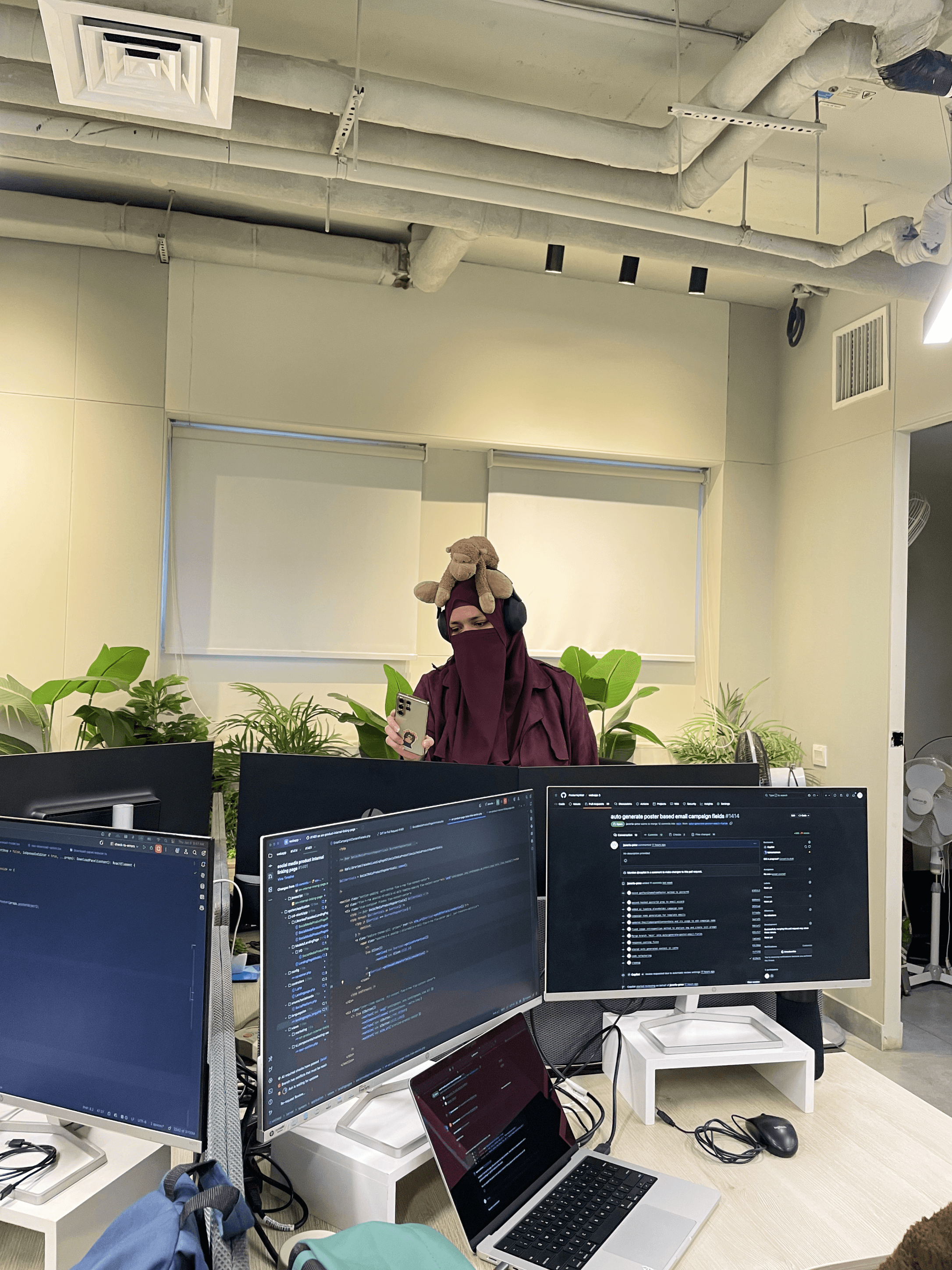
Table of contents
Table of contents
Table of contents
📱
Context
Context
Context
Users, Existing Interface & Its Problems
🦅
Solutions
Solutions
Solutions
Iterations, Testing & Final Designs
🌳
Outcome
Outcome
Outcome
Overall Impact & What’s Next
Context
Users, Existing Interface & Its Problems
Users, Existing Interface & Its Problems
Who is using PosterMyWall?
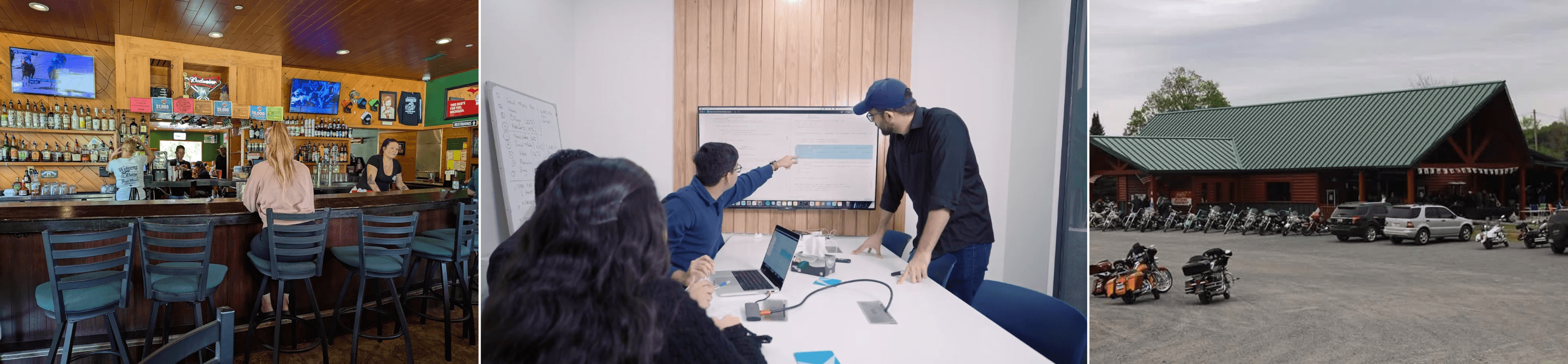
Small business owners (primarily), non-profits, agencies, musicians and then some - let’s take an example of a real customer to understand. Linda Ringler had been running Chase Creek Smokehouse in Texas. She was using PosterMyWall for over five years to handle all her promotional designs - from daily menus to her annual barbecue event.
She wanted to create on the go from her phone between kitchen checks, but the mobile experience often sent her back to her laptop. Regardless, it remained her reliable tool as it was simple, judgment-free, and trusted by her customers.
Linda has given consent to be featured in case studies & promotional content.

Problems with the previous mobile interface
It felt overly rigid and a desktop transplant onto a small screen. This made navigation slow, as it relied on taps rather than fluid, intuitive gestures. Key modern conveniences like auto-save and multi-select were absent, forcing tedious manual workflows. Its lack of progressive disclosure meant too many basic options were always visible, yet it still lacked the depth for granular, professional editing.
Solutions
Iterations, Testing & Final Designs
Iterations, Testing & Final Designs
Given all these foundational constraints, the redesign focused on four key areas: interaction, creativity, workflow, and user output.
Each iteration was critiqued based on UX principles, emotional feel, and thorough testing with small biz owners, educators, non-profits & marketing agencies to define a preferred direction.
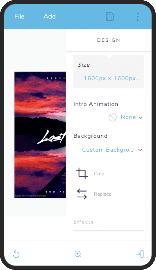
Core Interaction & Simpler UX
Core Interaction & Simpler UX
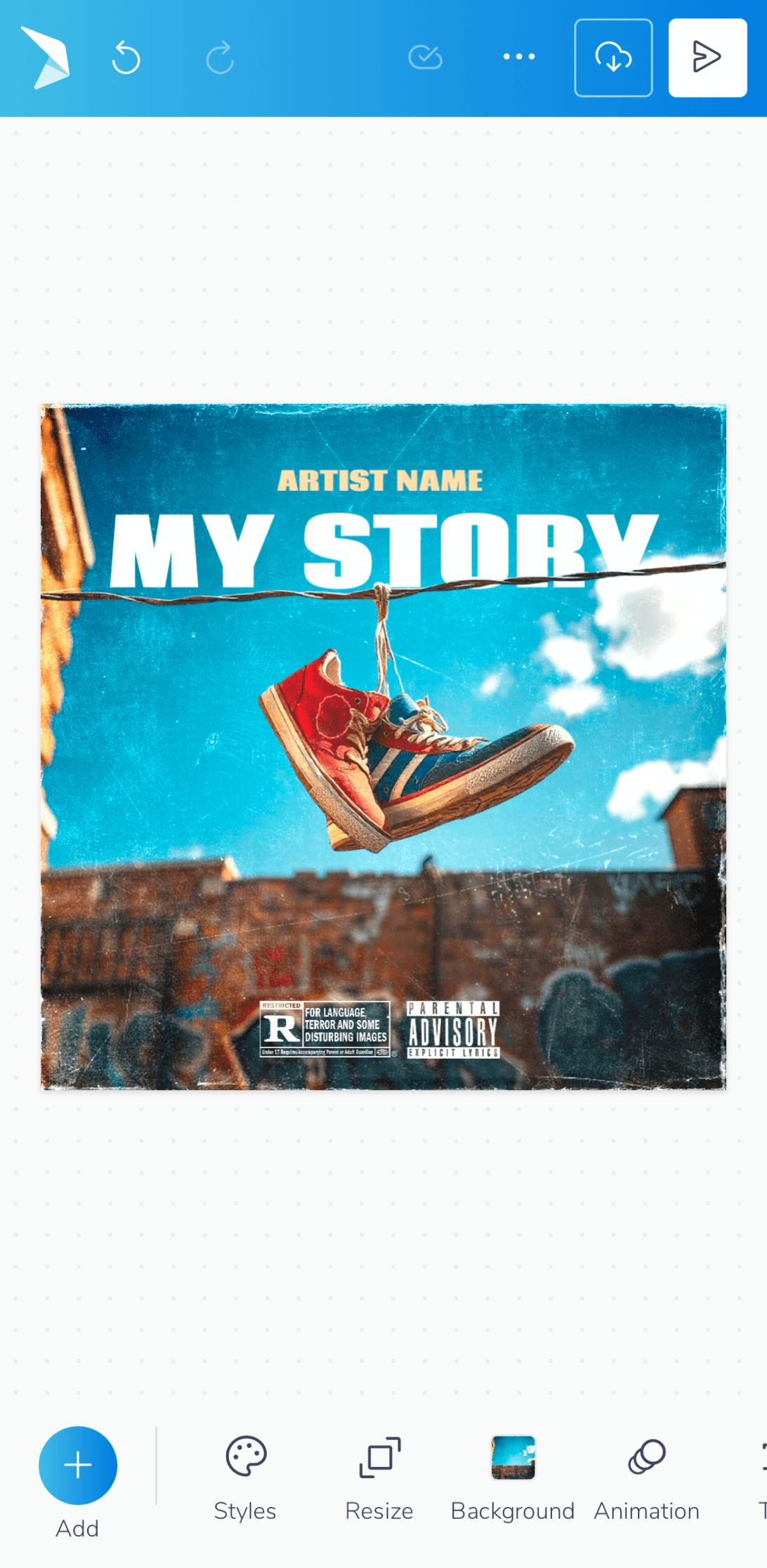
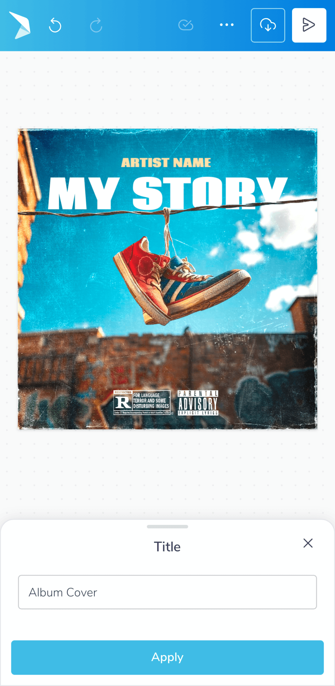
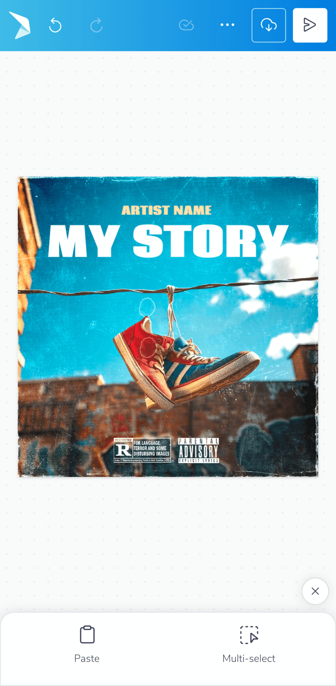
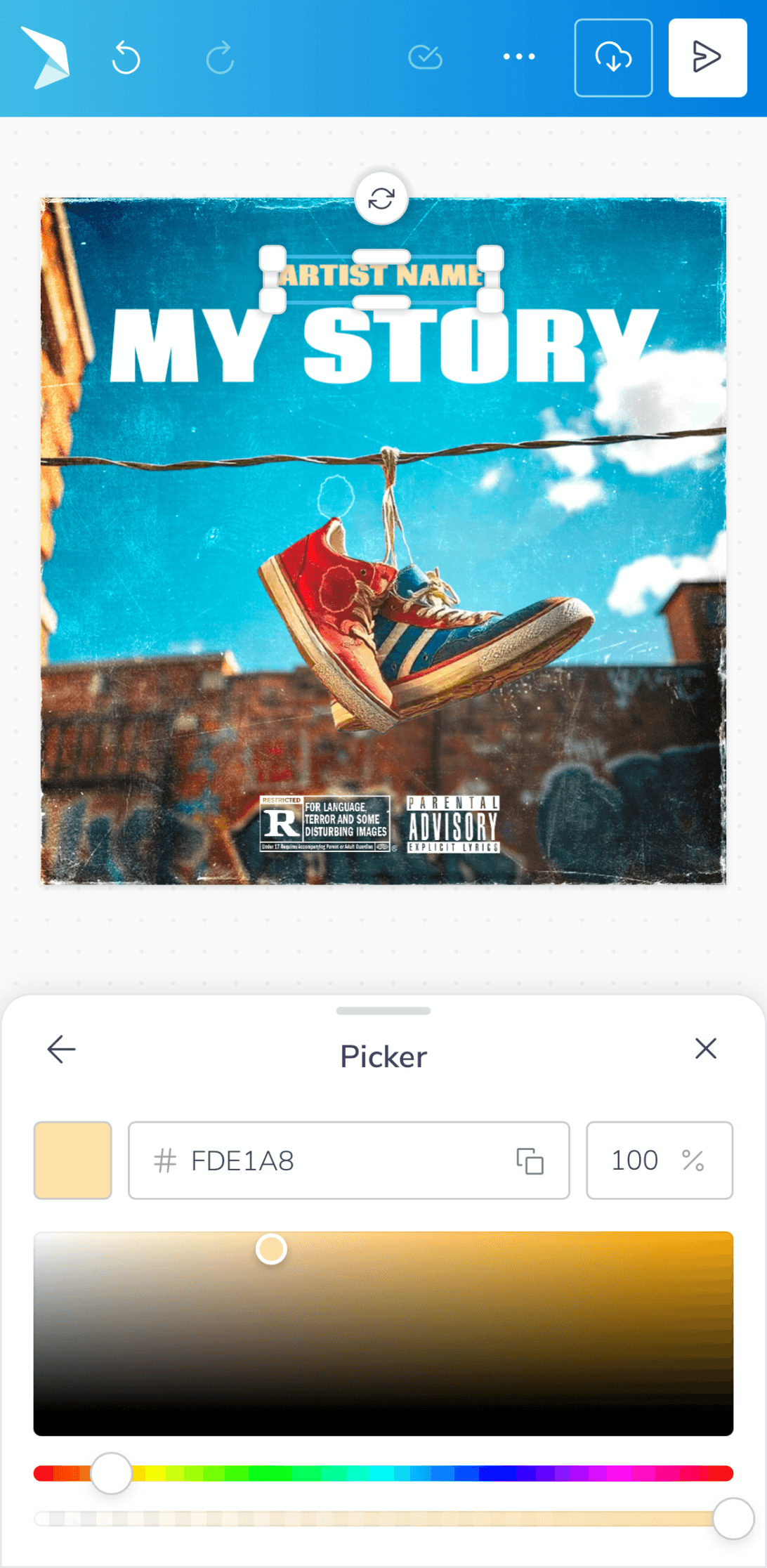
We simplified the interface, hiding advanced tools to keep it clean. Now you can navigate naturally with gestures like pinch and tap. Menus are smarter, showing you what you need with helpful hints to guide you smoothly.


Creative & Editing Capabilities
Creative & Editing Capabilities
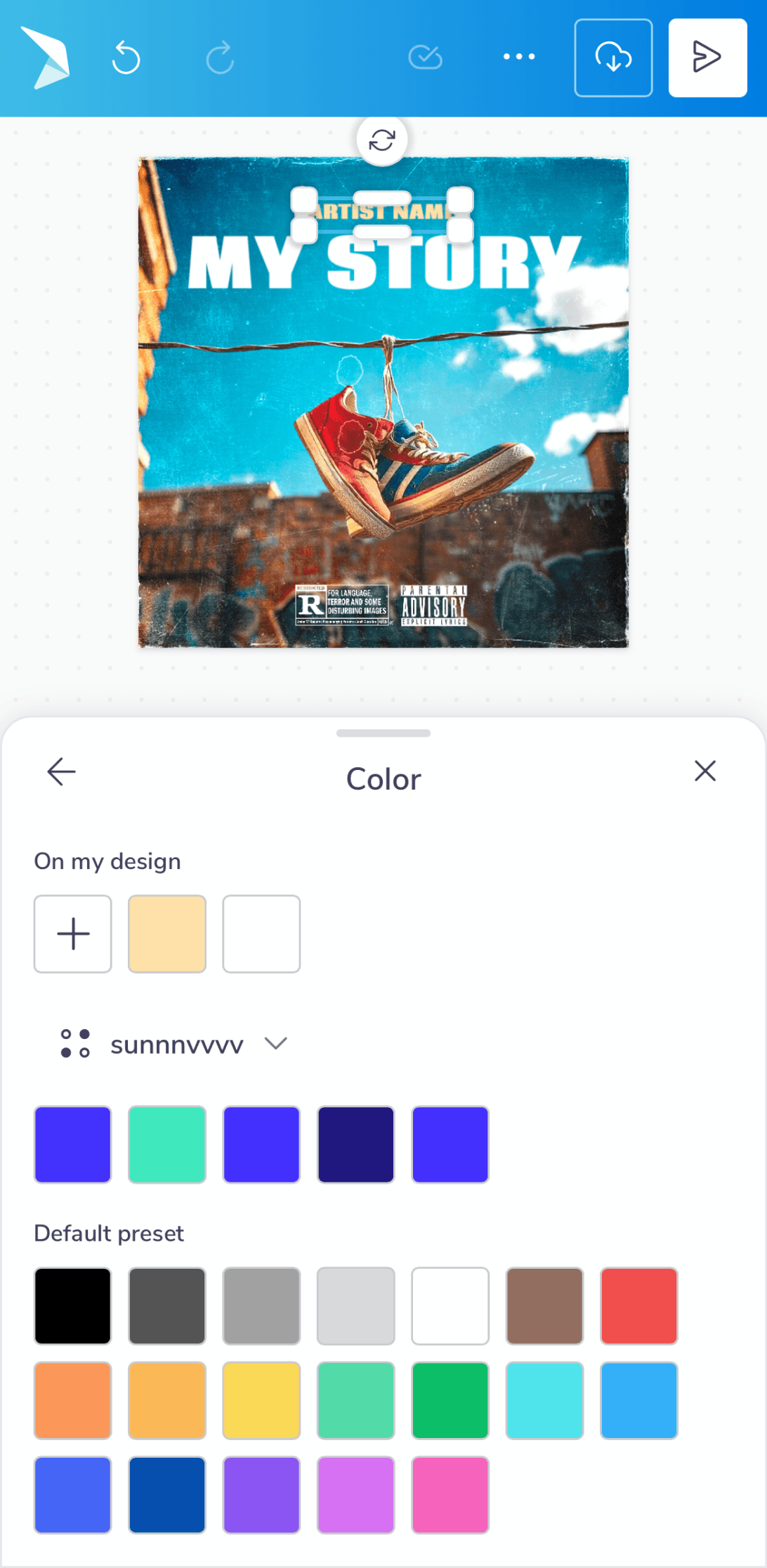
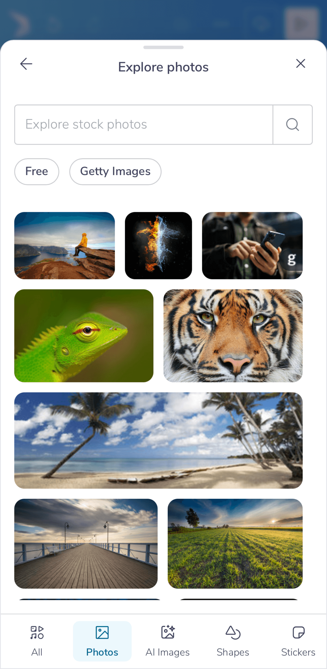
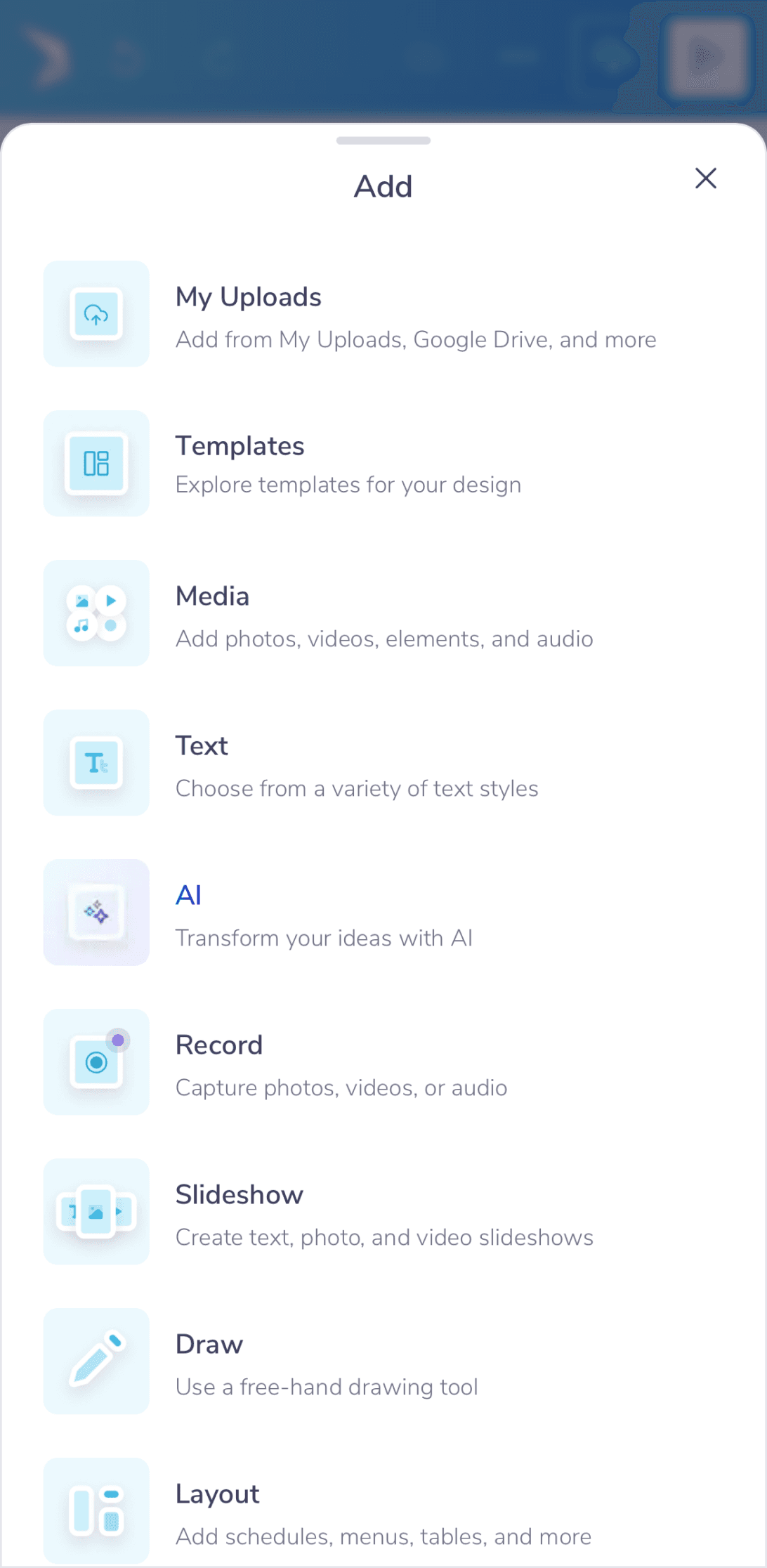
We upgraded all creative tools, giving users more control over photos, video, elements & audio with features like masking and multi-track editing. Adding and customizing elements, from text to shapes became more powerful with new drawing tools and flexible font and color pickers. Workflows were also streamlined with better canvas controls and introducing the ability to easily select and group multiple items.


Asset Management & Workflows
Asset Management & Workflows
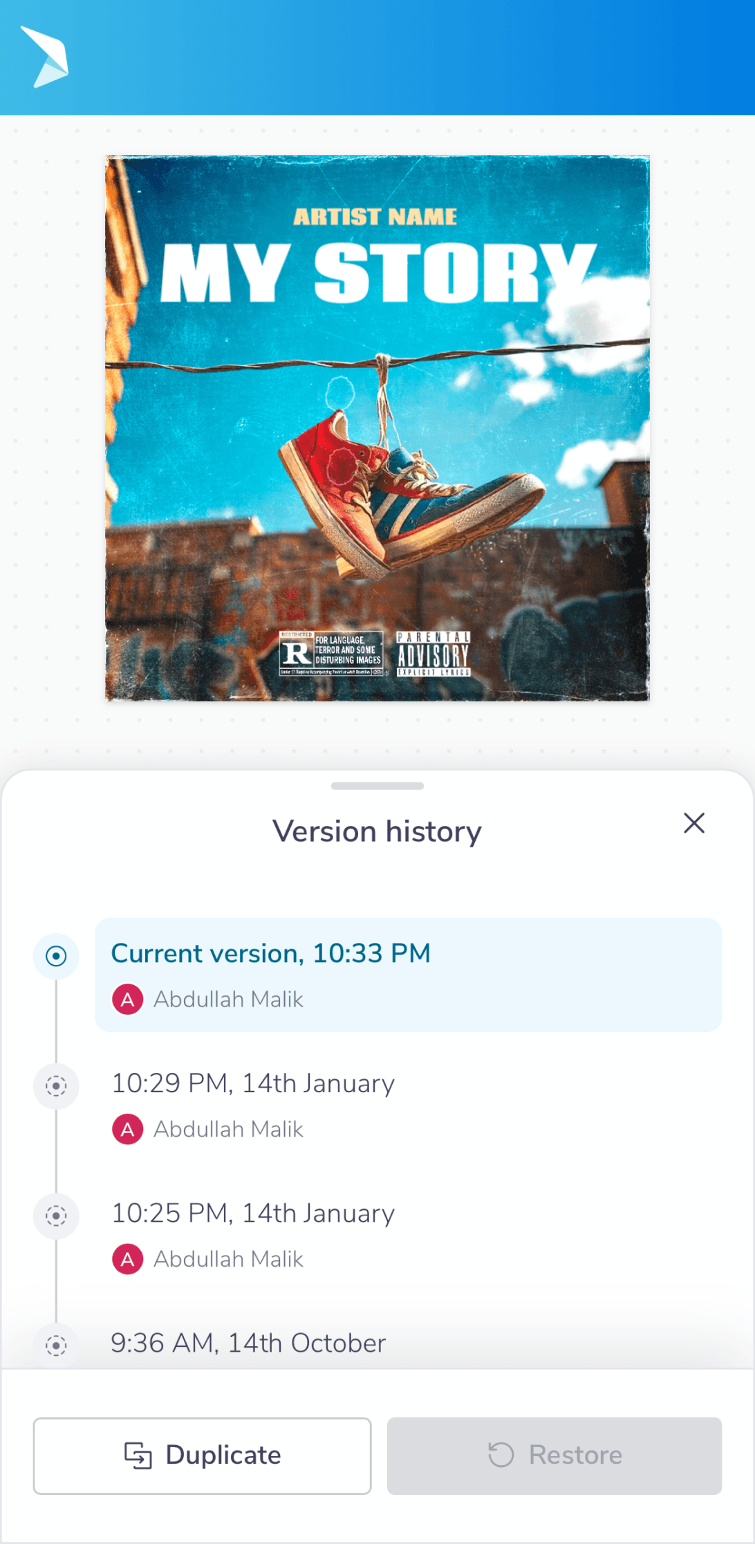
Asset management was overhauled with a more organized uploads area, a richer elements library, and tools like Brand Kits for consistency. The workspace itself became more flexible, supporting multi-page projects, real-time auto-save, and more intuitive canvas sizing.


Output & User Feedback
Output & User Feedback
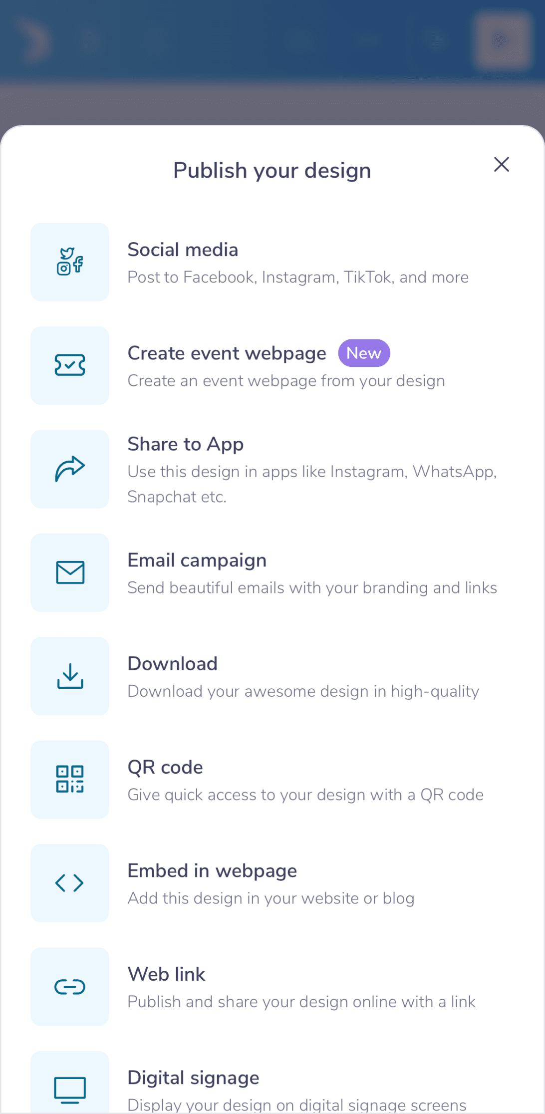
The focus now shifts towards getting your work into the world with streamlined publishing, downloading, and sharing. Simple, instant snackbars were also added to provide clear feedback as you work.


Overall Impact & What’s Next
Overall Impact & What’s Next
Ultimately, we transformed PosterMyWall from a utility into a trusted creative companion. For users like Linda, this meant no longer wrestling with a tool, but rather flowing with it - designing menus, flyers, and event posters with intuitive ease. This restored sense of creative confidence is reflected in the numbers:
19% surge in user retention
15% gains in saves and downloads
8% drop in bounce rate for new users
While no design is ever perfect, these results affirm we're on the right path and we remain committed to listening, learning, and enhancing that experience every single day.
Hi 👋🏼. Thank you for your time.
Hi 👋🏼. Thank you for your time.
Simpler design editing on mobile
Simpler design editing on mobile
Simpler design editing on mobile
Apr 2023
-
Jan 2024
Senior Designer
Me & Ahmad
In a nutshell
In a nutshell
Over 40% of our users (Small Business Owners) were attempting to create designs and edit templates on mobile, but editing on mobile devices provided a frustrating experience, lacking key gestures & buried essential tools among other crucial flaws.
To solve this, we undertook a mobile-first redesign that introduced intuitive gestures and an enhanced contextual model, transforming mobile from a last resort into a preferred creative platform. Here’s a summary of that transformation:
A deeper look
A deeper look
As we delve into the complete narrative, we’ll explore the context, solutions, iterations, outcome & the overall impact in more depth ahead.
Table of contents
Table of contents
Table of contents
📱
Context
Context
Context
Users, Existing Interface & Its Problems
🦅
Solutions
Solutions
Solutions
Iterations, Testing & Final Designs
🌳
Outcome
Outcome
Outcome
Overall Impact & What’s Next
Context
Users, Existing Interface & Its Problems
Users, Existing Interface & Its Problems
Who is using PosterMyWall?
Small business owners (primarily), non-profits, agencies, musicians and then some - let’s take an example of a real customer to understand. Linda Ringler had been running Chase Creek Smokehouse in Texas. She was using PosterMyWall for over five years to handle all her promotional designs - from daily menus to her annual barbecue event.
She wanted to create on the go from her phone between kitchen checks, but the mobile experience often sent her back to her laptop. Regardless, it remained her reliable tool as it was simple, judgment-free, and trusted by her customers.
Linda has given consent to be featured in case studies & promotional content.
Problems with the previous mobile interface
It felt overly rigid and a desktop transplant onto a small screen. This made navigation slow, as it relied on taps rather than fluid, intuitive gestures. Key modern conveniences like auto-save and multi-select were absent, forcing tedious manual workflows. Its lack of progressive disclosure meant too many basic options were always visible, yet it still lacked the depth for granular, professional editing.
Solutions
Iterations, Testing & Final Designs
Iterations, Testing & Final Designs
Given all these foundational constraints, the redesign focused on four key areas: interaction, creativity, workflow, and user output.
Each iteration was critiqued based on UX principles, emotional feel, and thorough testing with small biz owners, educators, non-profits & marketing agencies to define a preferred direction.
Core Interaction & Simpler UX
Core Interaction & Simpler UX
We simplified the interface, hiding advanced tools to keep it clean. Now you can navigate naturally with gestures like pinch and tap. Menus are smarter, showing you what you need with helpful hints to guide you smoothly.
Creative & Editing Capabilities
Creative & Editing Capabilities
We upgraded all creative tools, giving users more control over photos, video, elements & audio with features like masking and multi-track editing. Adding and customizing elements, from text to shapes became more powerful with new drawing tools and flexible font and color pickers. Workflows were also streamlined with better canvas controls and introducing the ability to easily select and group multiple items.
Asset Management & Workflows
Asset Management & Workflows
Asset management was overhauled with a more organized uploads area, a richer elements library, and tools like Brand Kits for consistency. The workspace itself became more flexible, supporting multi-page projects, real-time auto-save, and more intuitive canvas sizing.
Output & User Feedback
Output & User Feedback
The focus now shifts towards getting your work into the world with streamlined publishing, downloading, and sharing. Simple, instant snackbars were also added to provide clear feedback as you work.
Overall Impact & What’s Next
Overall Impact & What’s Next
Ultimately, we transformed PosterMyWall from a utility into a trusted creative companion. For users like Linda, this meant no longer wrestling with a tool, but rather flowing with it - designing menus, flyers, and event posters with intuitive ease. This restored sense of creative confidence is reflected in the numbers:
19% surge in user retention
15% gains in saves and downloads
8% drop in bounce rate for new users
While no design is ever perfect, these results affirm we're on the right path and we remain committed to listening, learning, and enhancing that experience every single day.
Hi 👋🏼. Thank you for your time.
Hi 👋🏼. Thank you for your time.